Highland Orchards
— Brand Identity, 2020 — Adobe Illustrator, Photoshop, After Effects, Sketch
-
Objective —
To refresh an established brand by developing a new visual identity system
-
About —
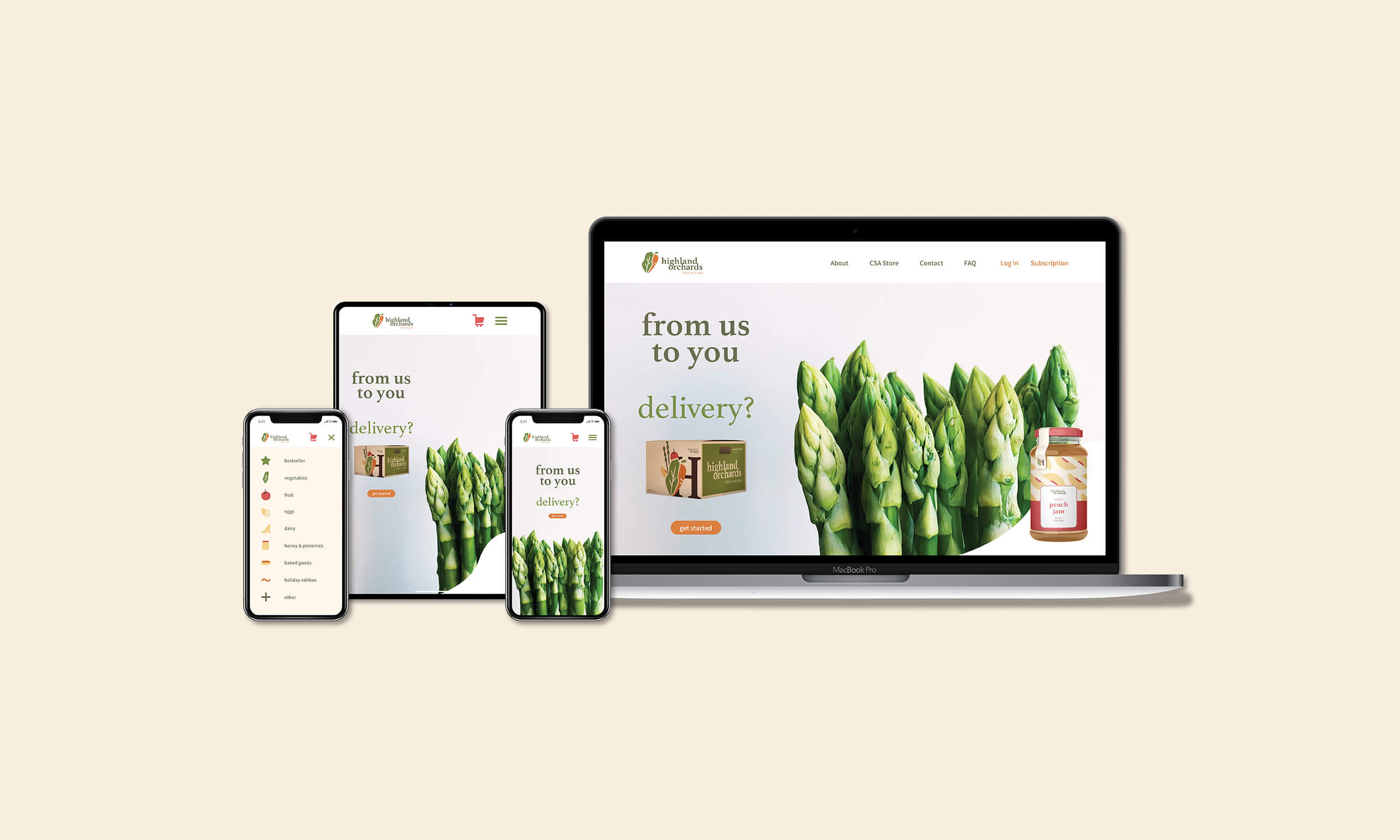
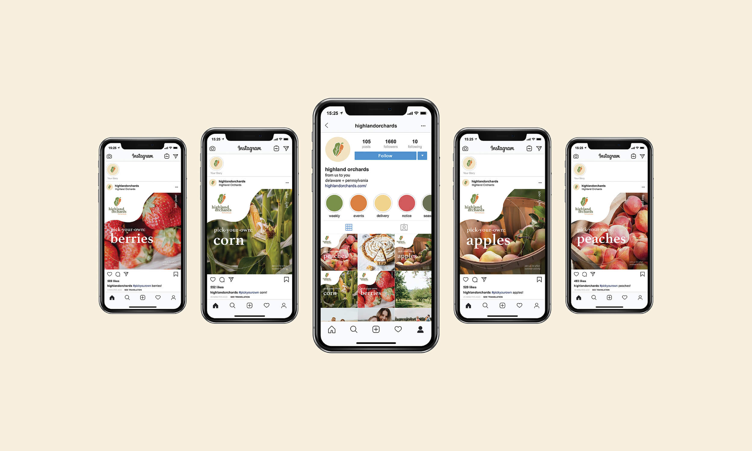
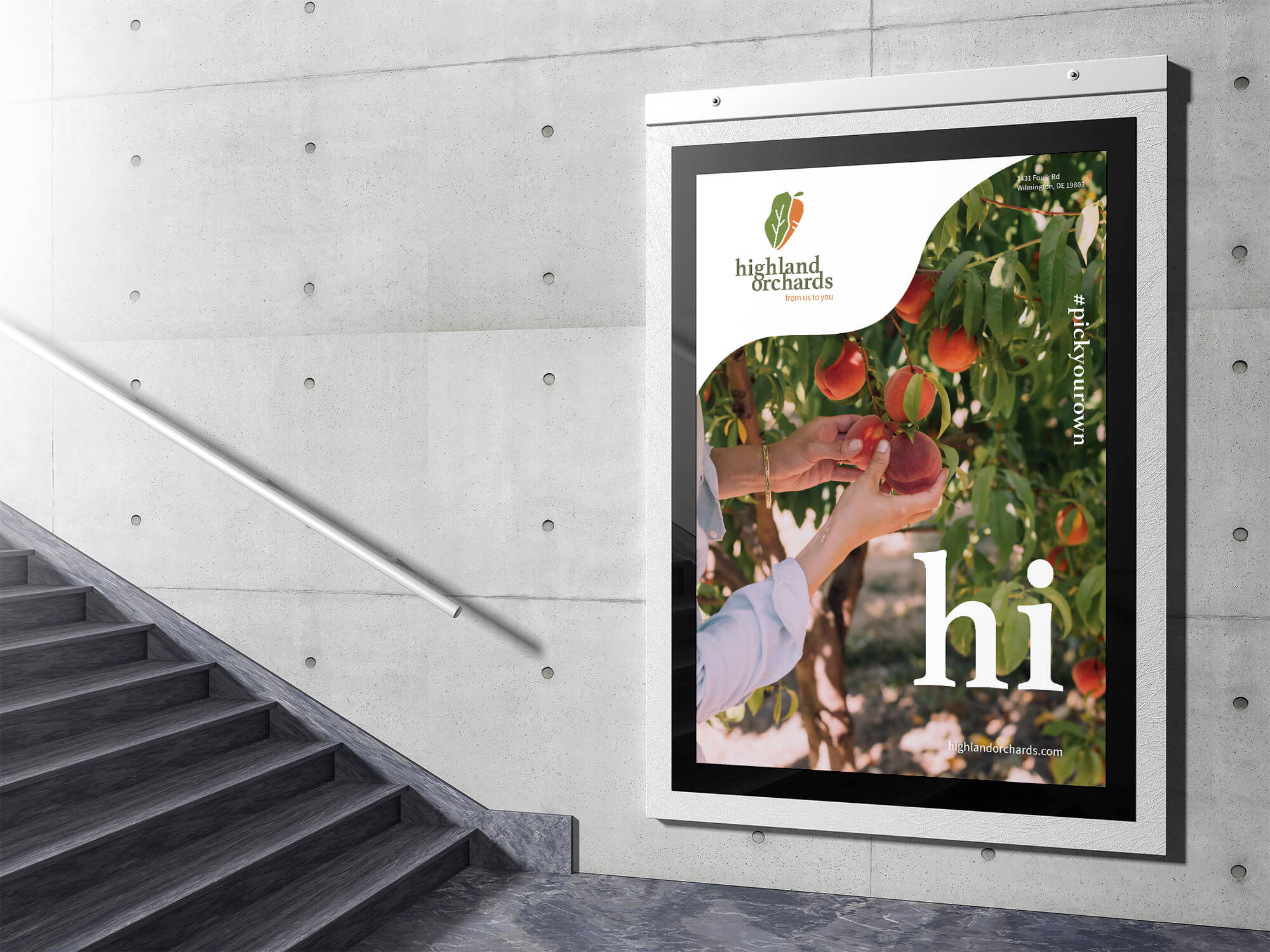
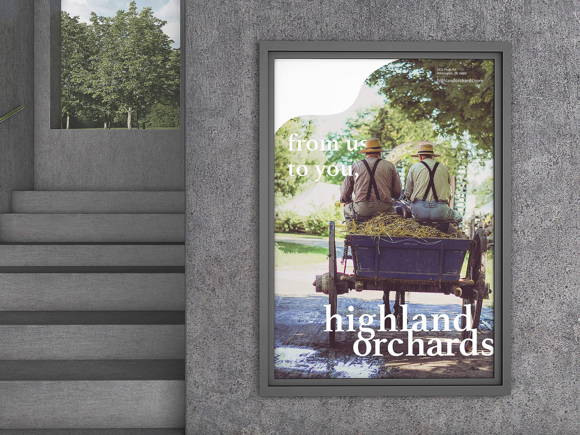
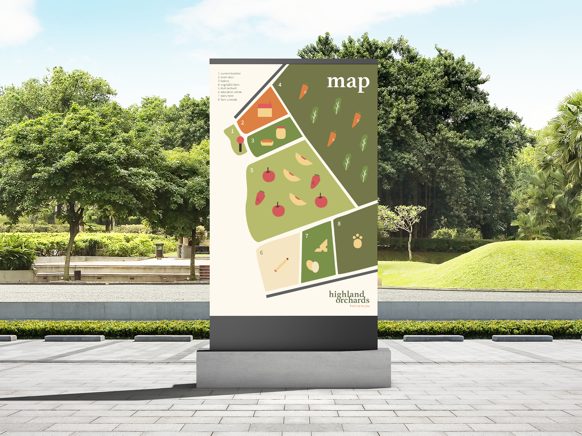
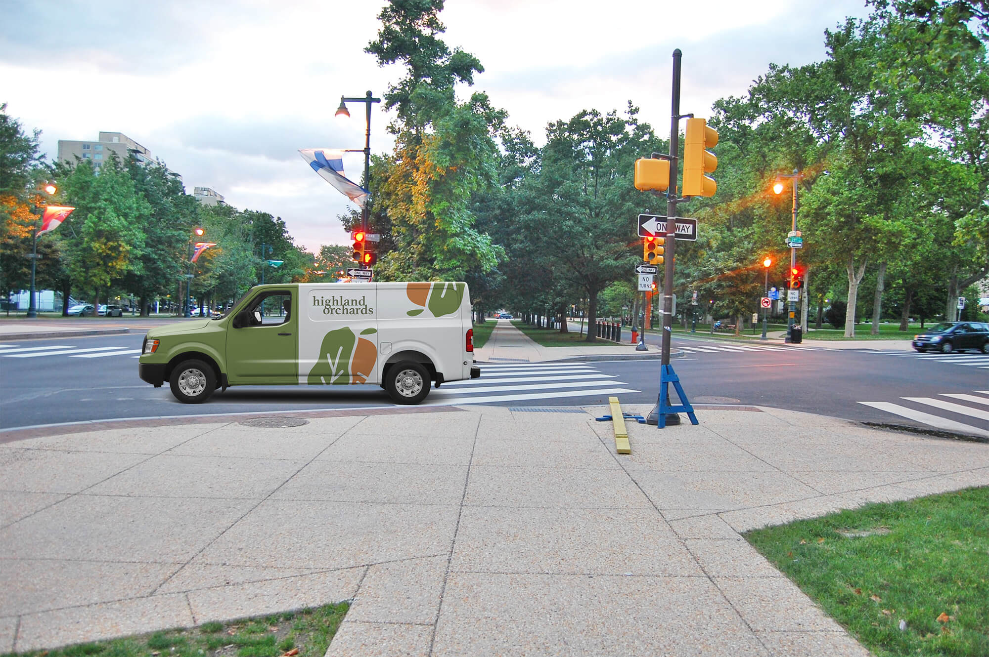
Highland Orchards provides a variety of fresh produce all year round, with seasonal specialties. Delaware and Philadelphia residents can either visit the orchard in-person to pick up groceries or subscribe to its delivery service. Other services and activities include subscription services, farmer’s market, bakery, pick-your-own, farm animal experiences, paving and excavating, educational programs, and other seasonal activities. Highland Orchards exhibits family-oriented values as a small local business.
-
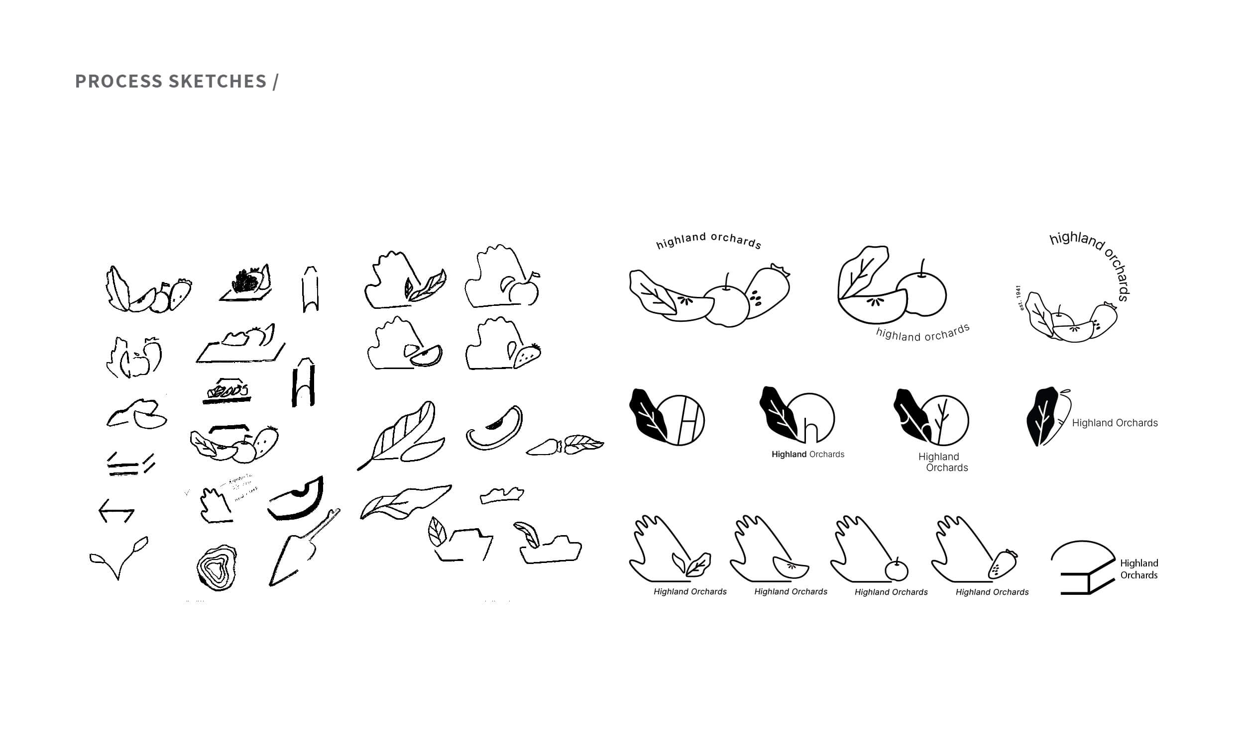
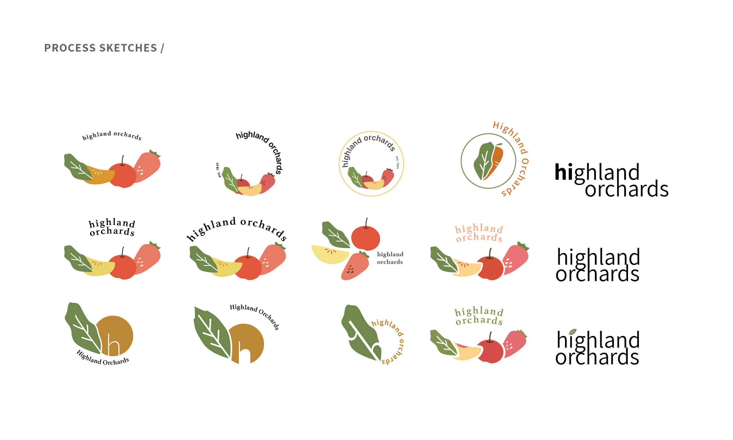
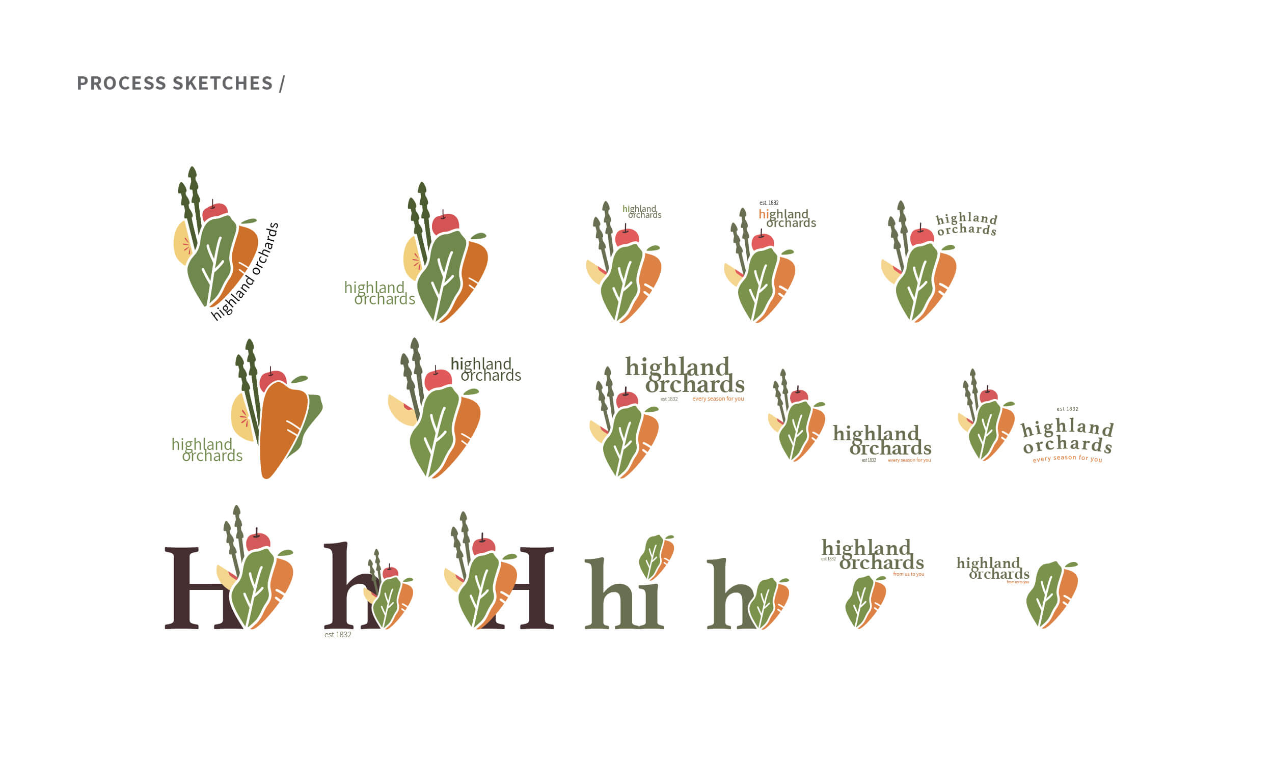
Process —
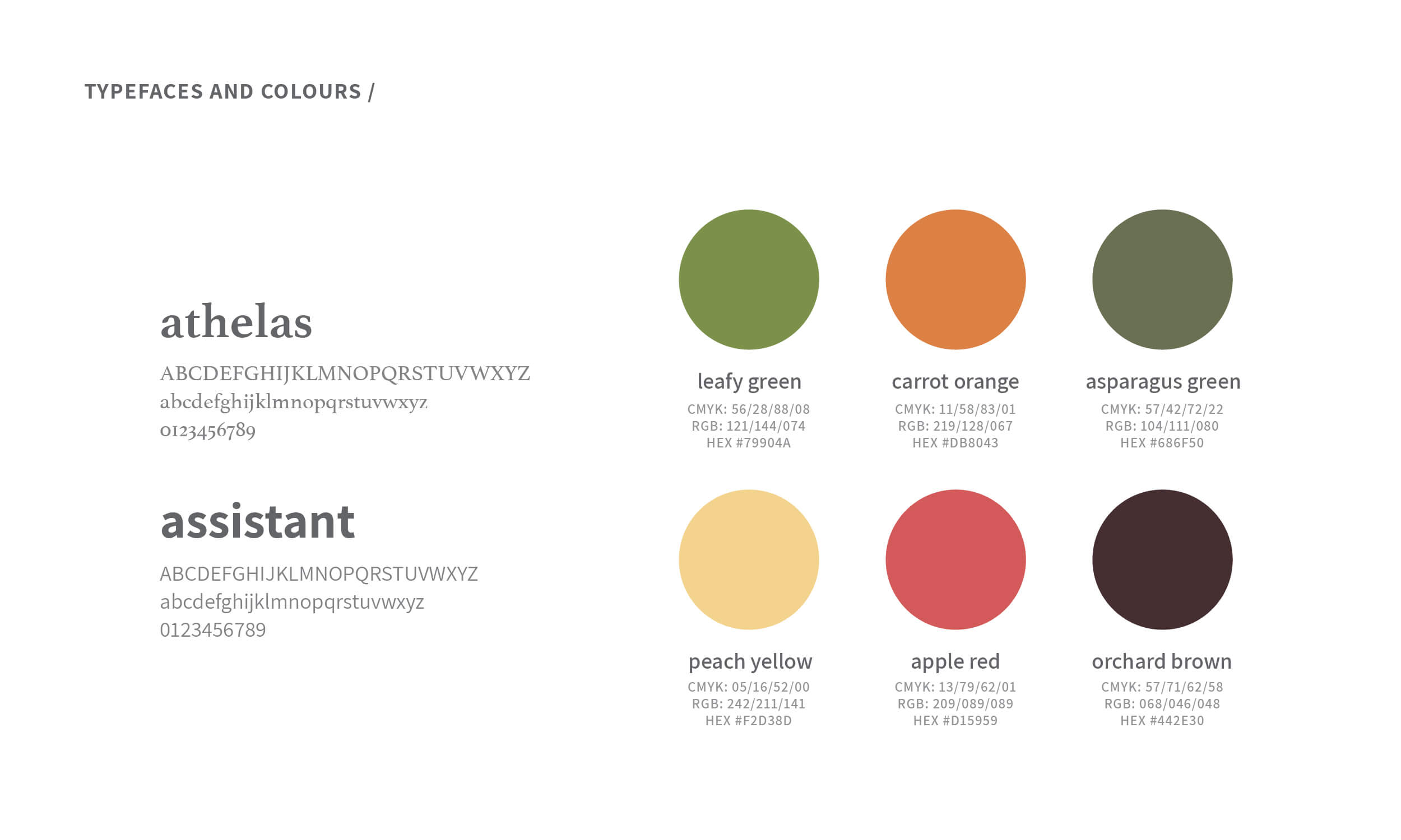
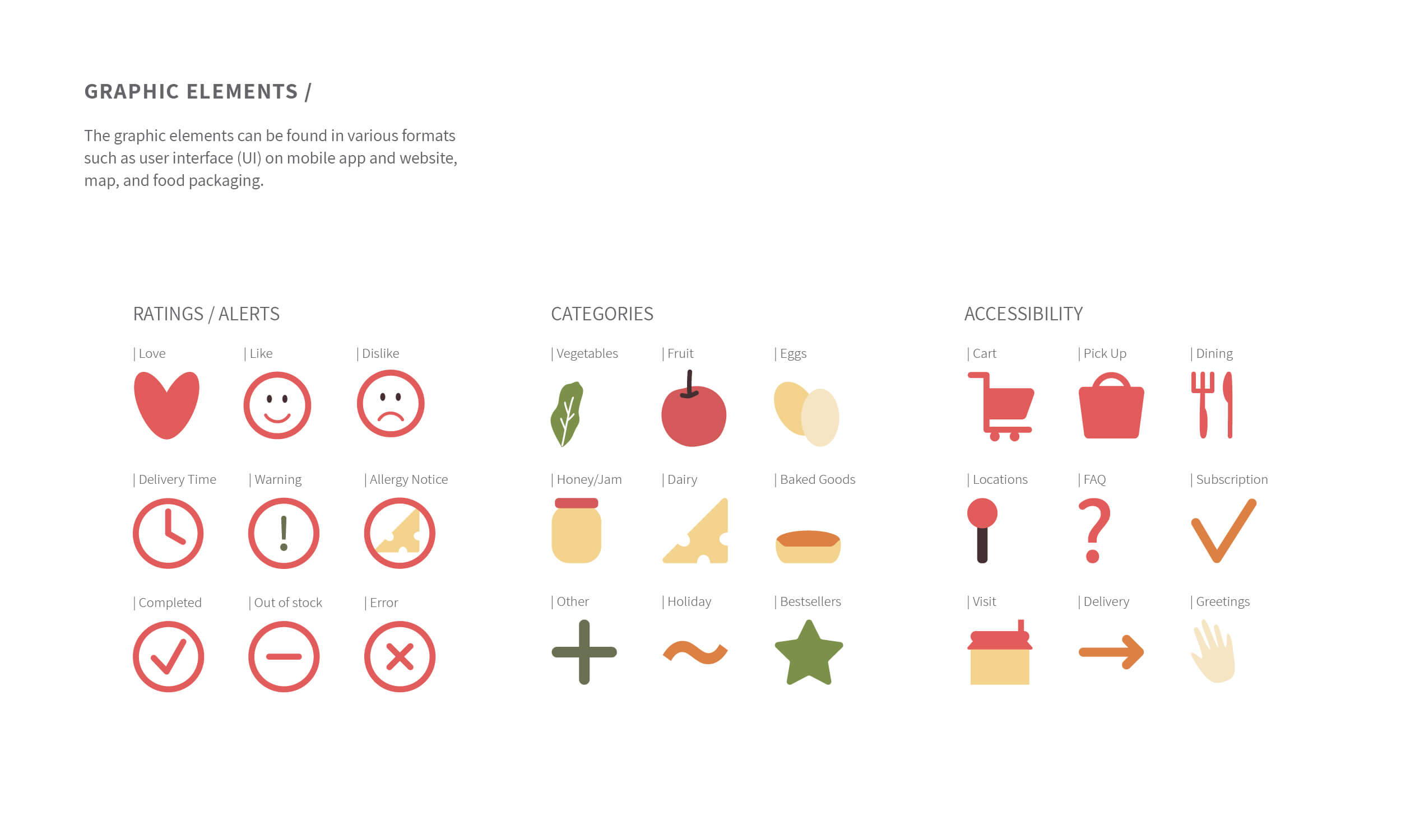
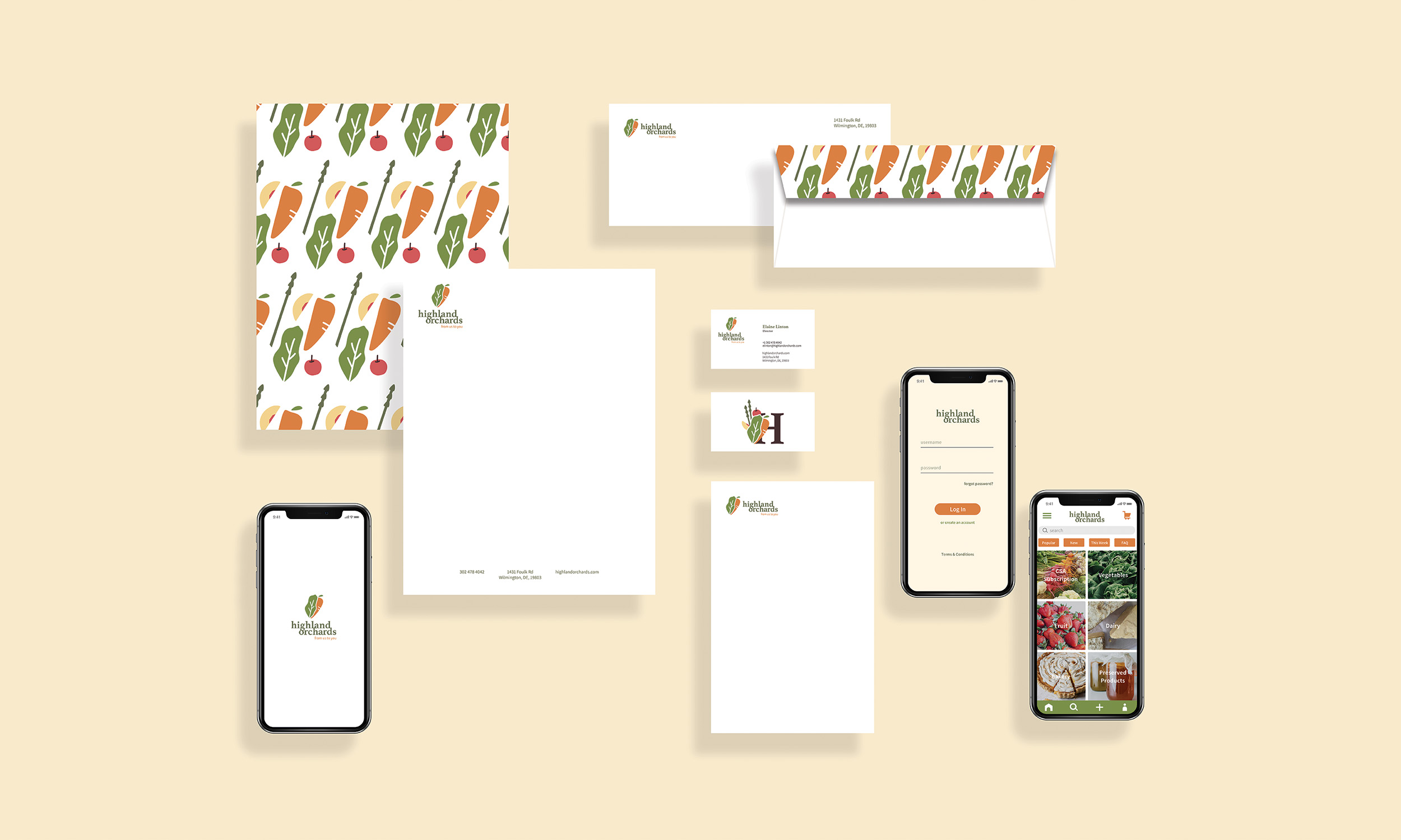
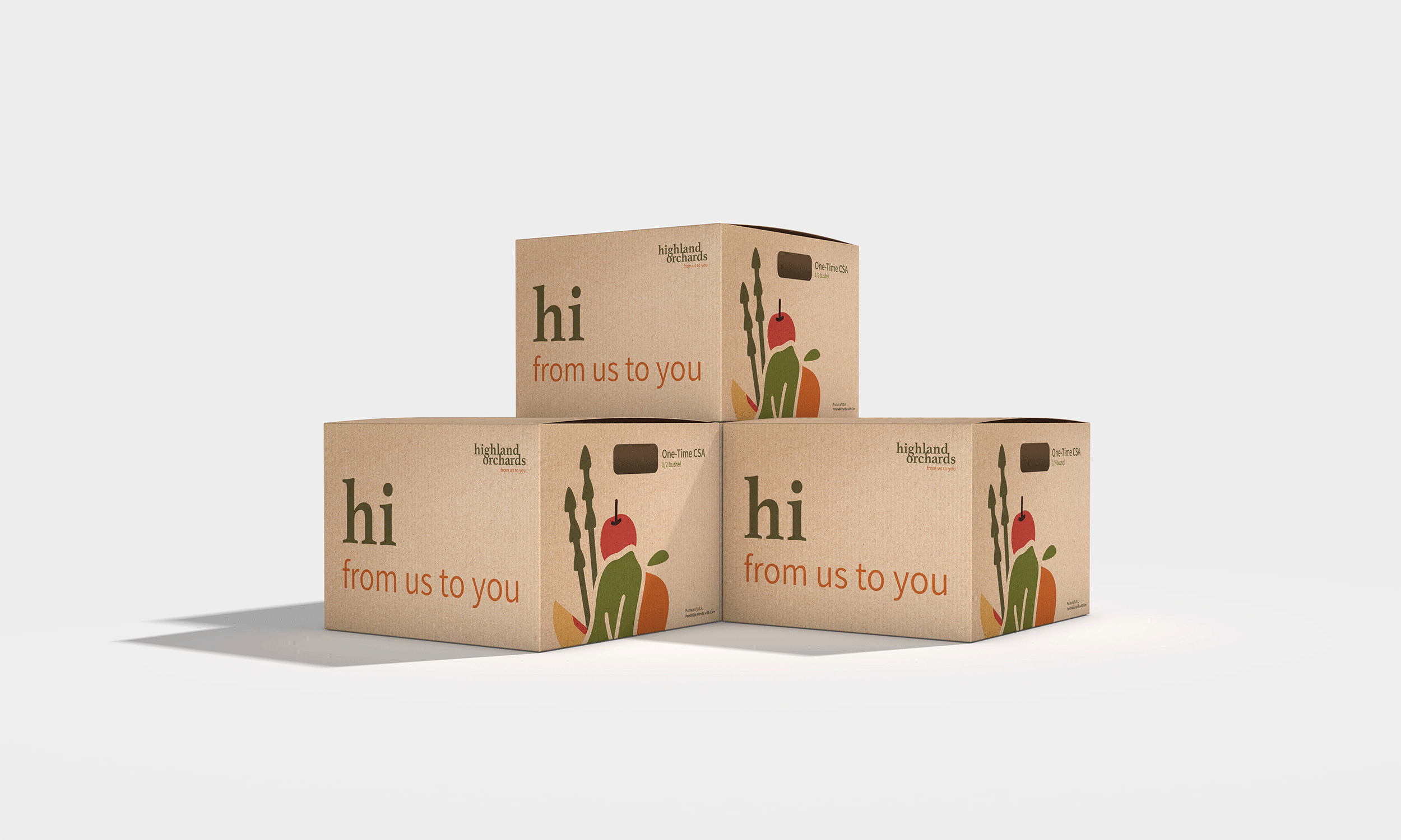
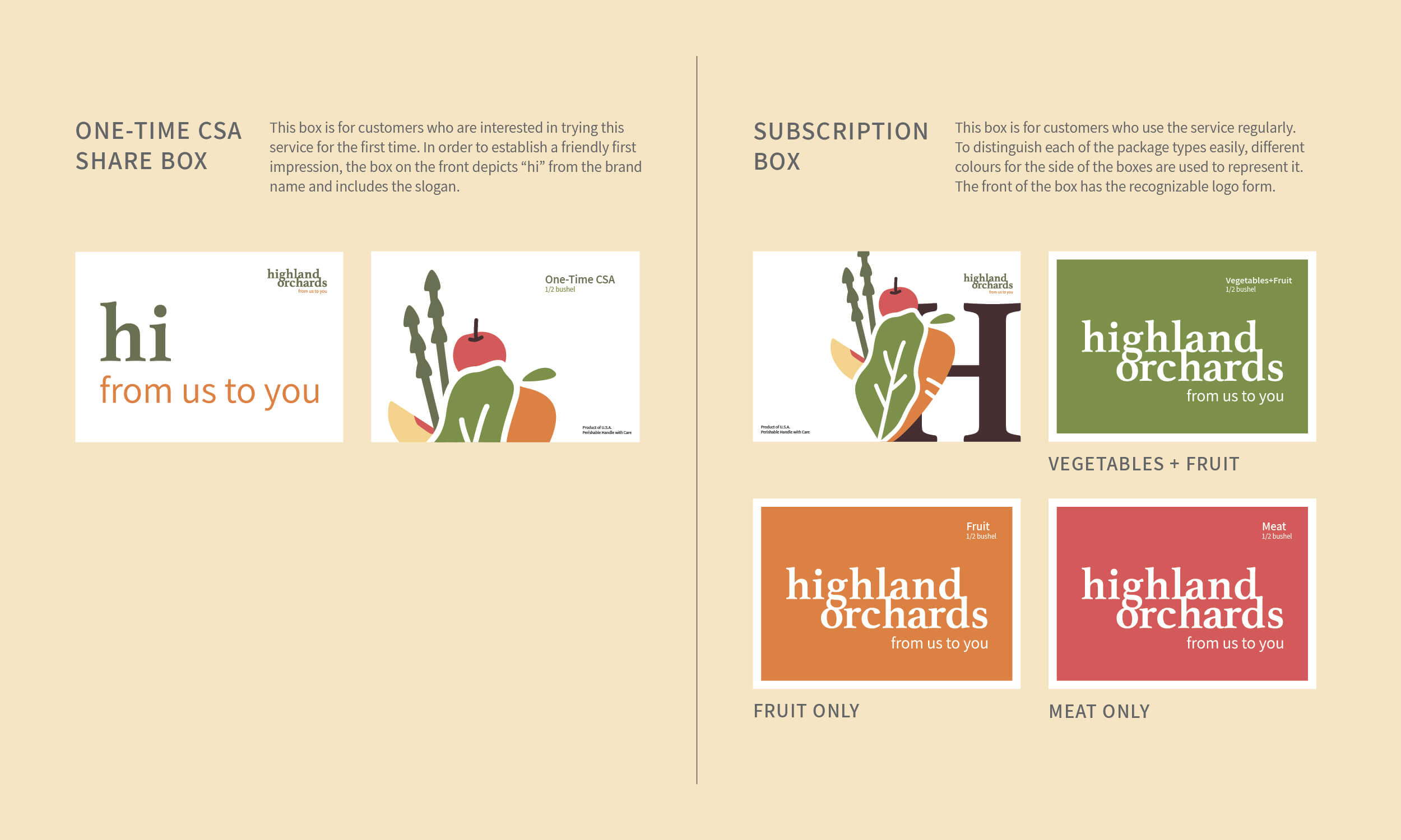
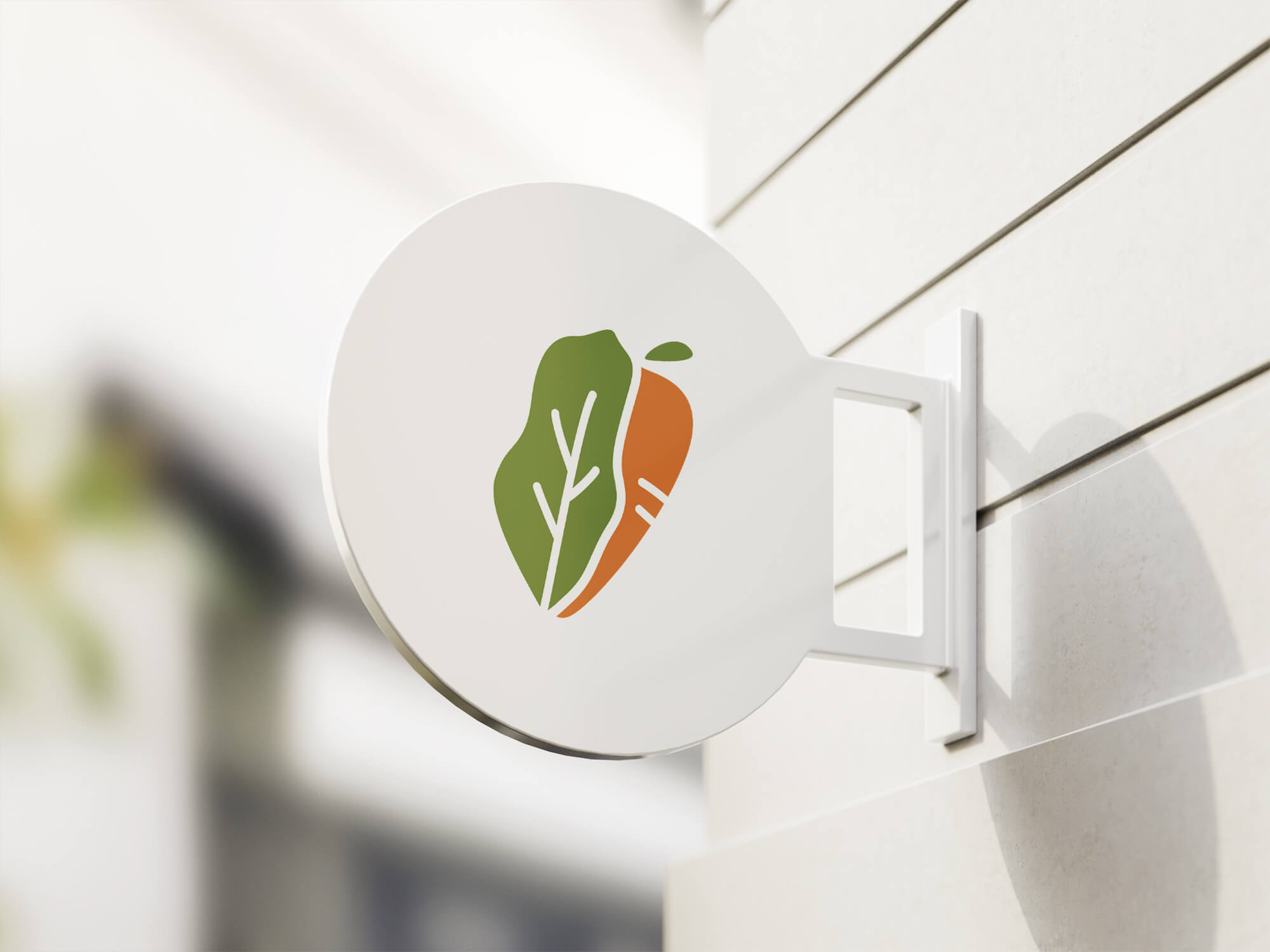
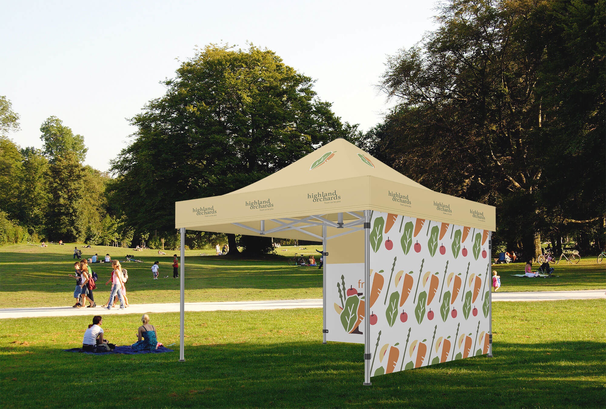
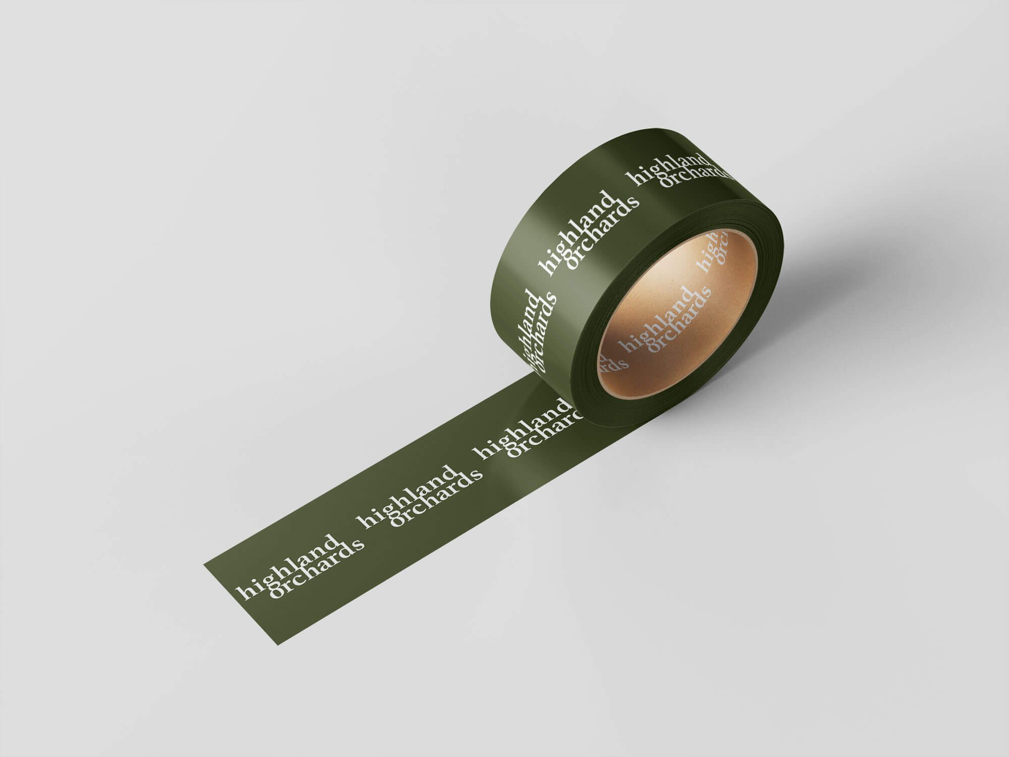
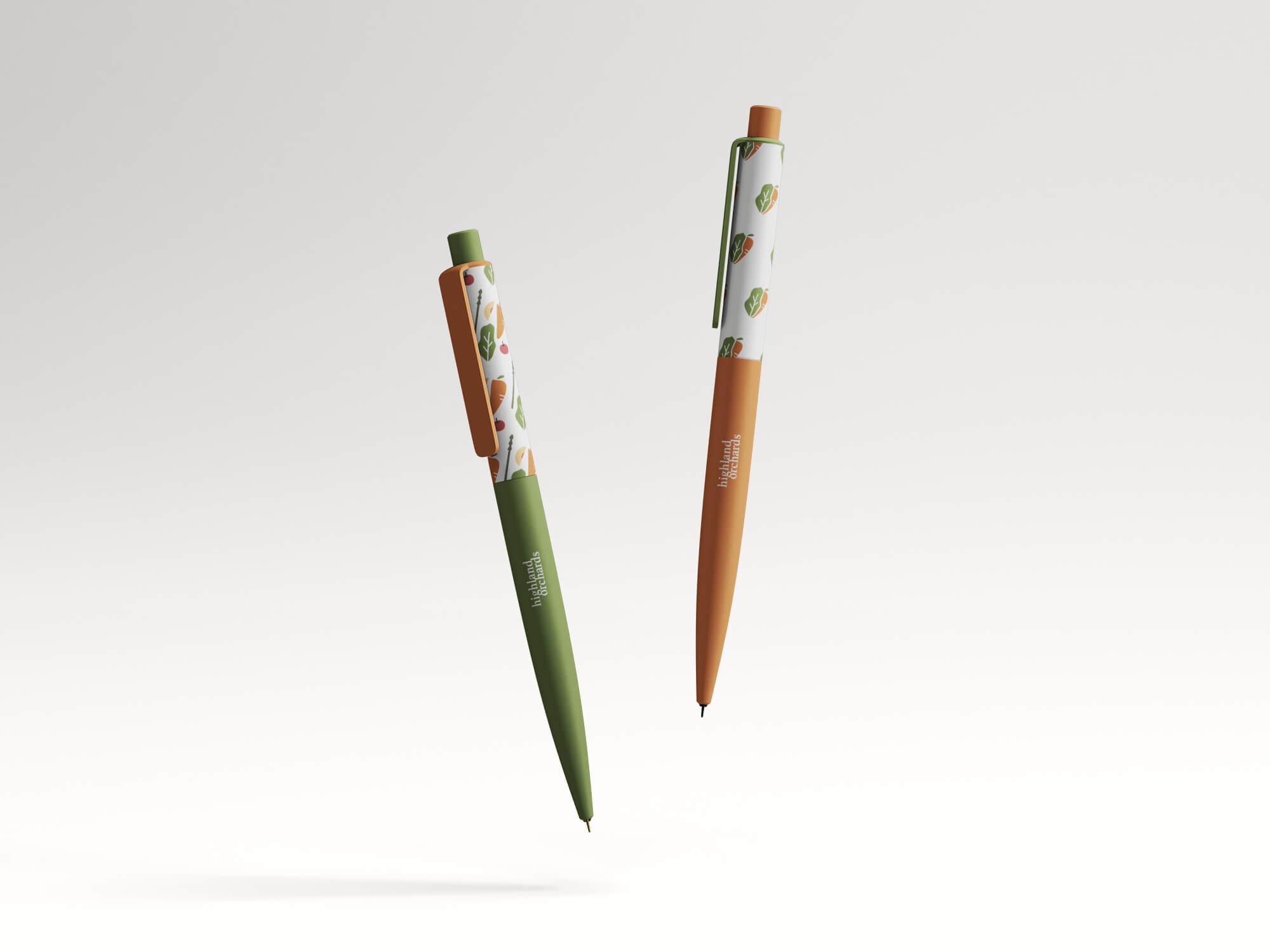
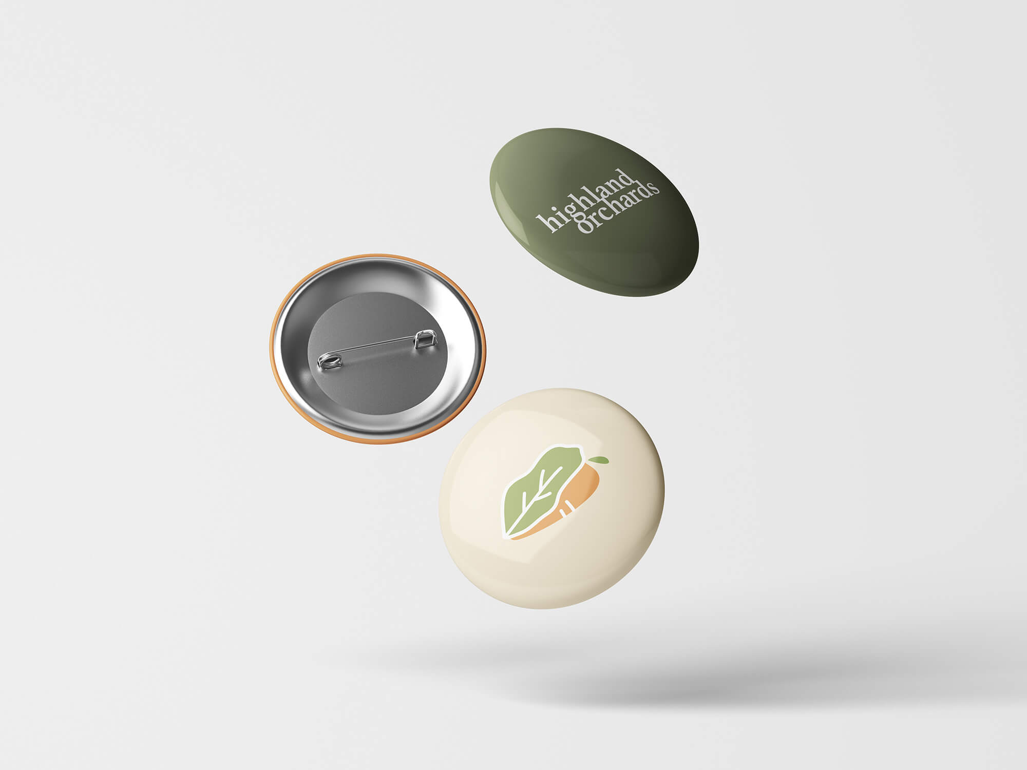
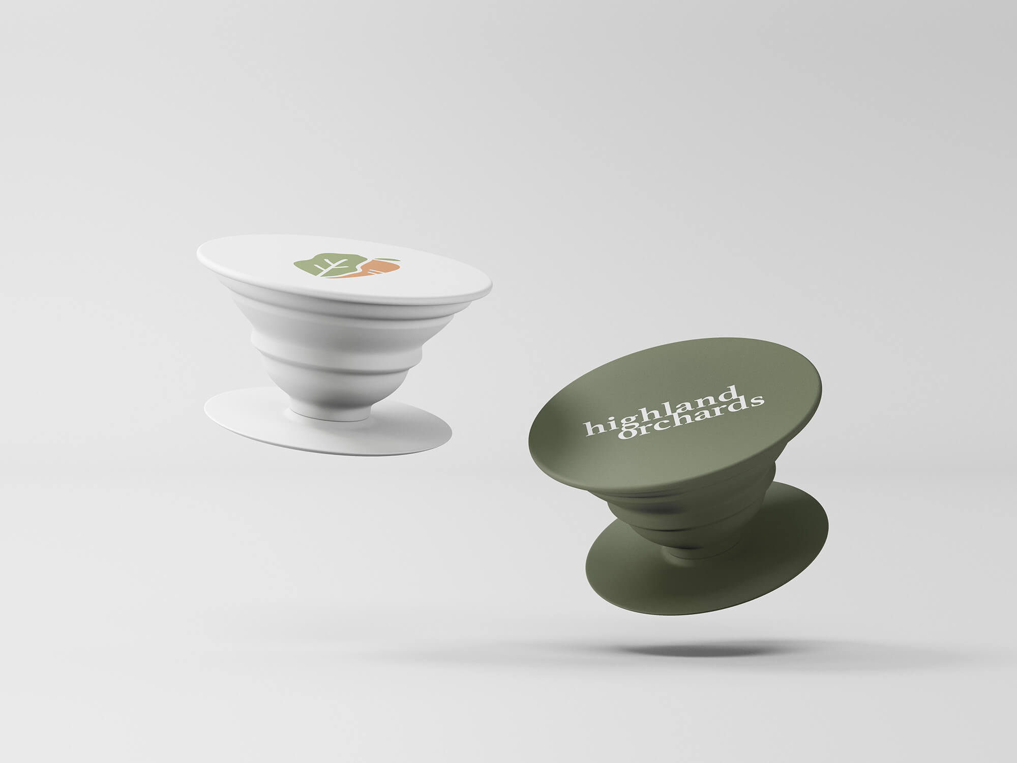
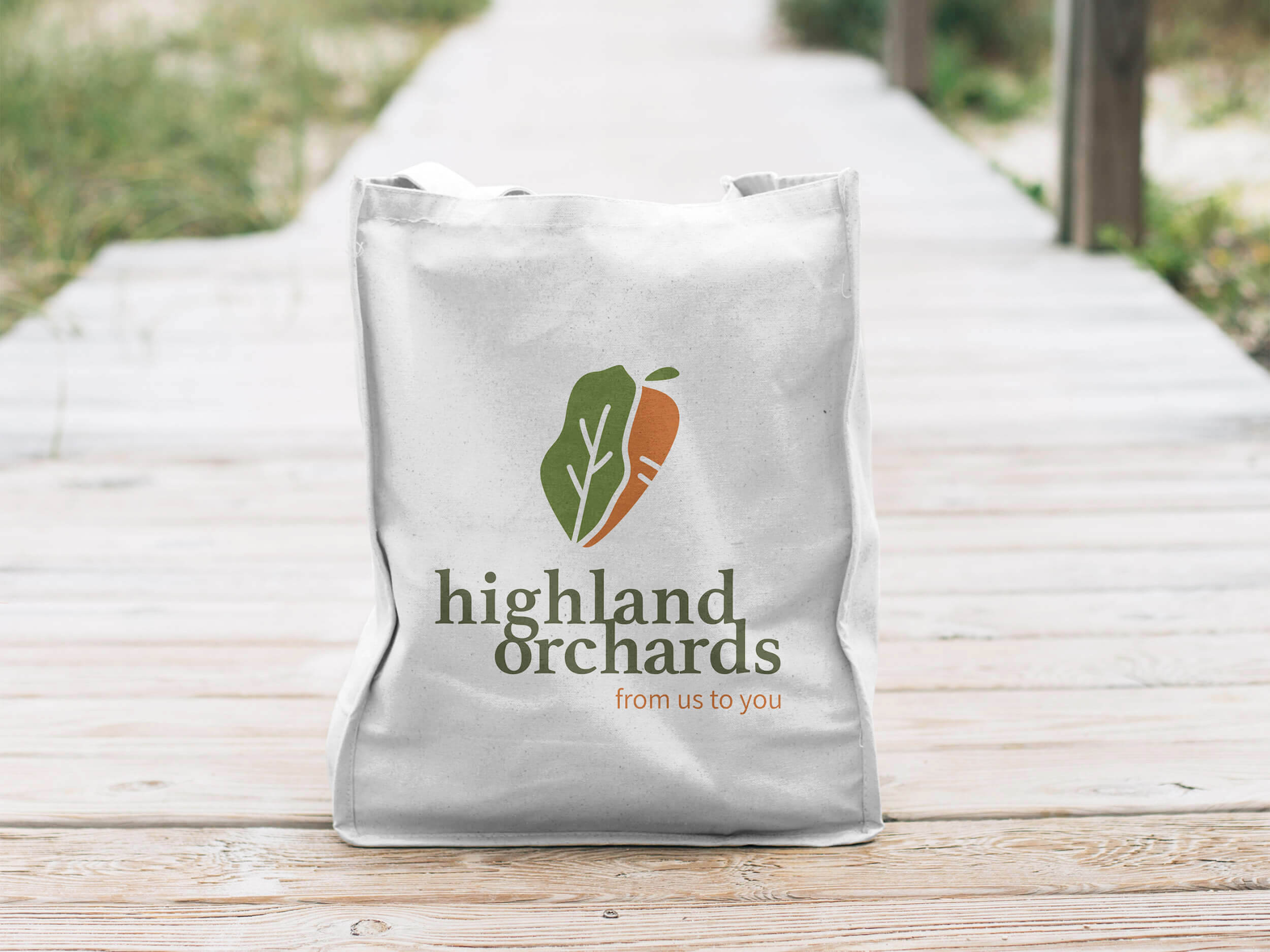
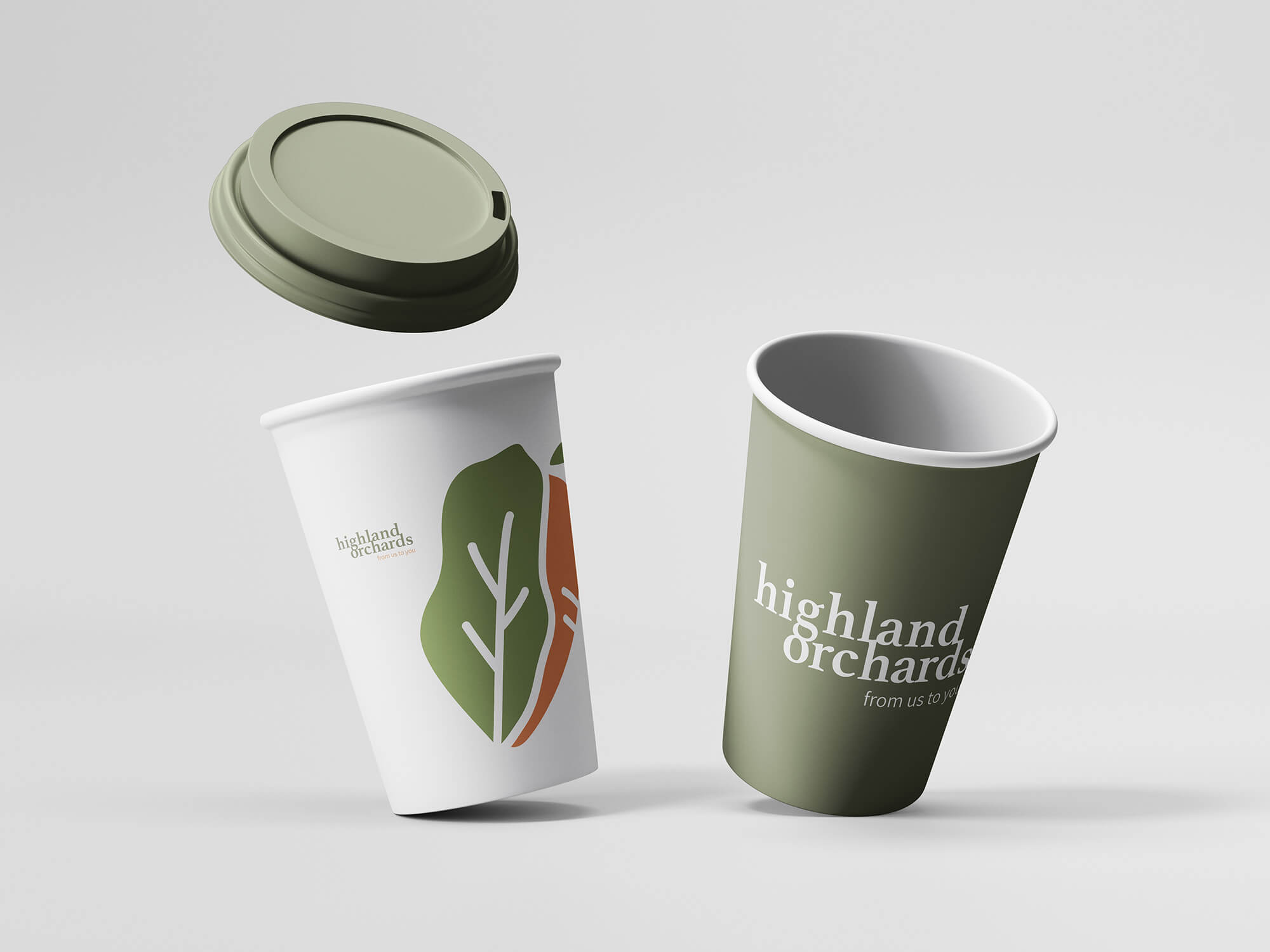
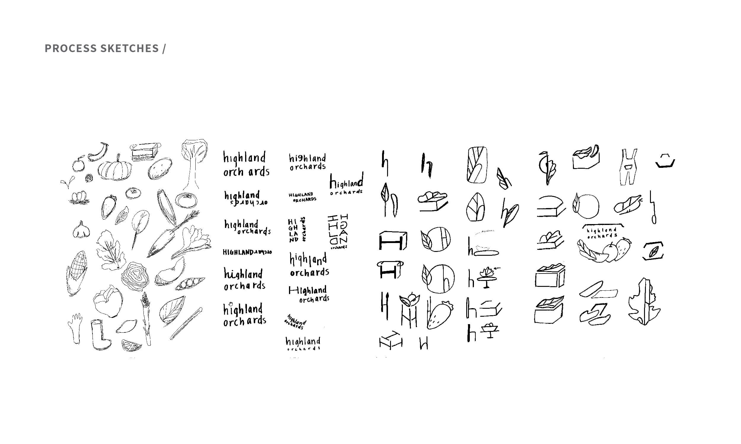
The logo is a combination of a leafy green and a carrot to highlight how the orchard offers both classic and seasonal produce; it also conveys the community that is formed around the orchard by its visitors. The secondary logo shows the addition of three more types of produce, with the new branding ultimately representing one classic type of produce and four other types, each representing one of the four seasons. The wordmark shifted from a sans-serif into a serif font in order to emphasize the organic look-and-feel; the connection between the top and bottom line indicates the connection between the brand and their consumers.